During hurricane season, spaghetti models are a frequently cited resource for helping forecast tropical systems. But there’s a lot you should know about spaghetti models and specifically, when and how best to use them.
Spaghetti models – also commonly referred to as spaghetti plots – can offer easy-to-digest (no pun intended) insight about a tropical system’s potential path.
They’re often cited by meteorologists during hurricane season, but there are also important distinctions about when and how best to use them.
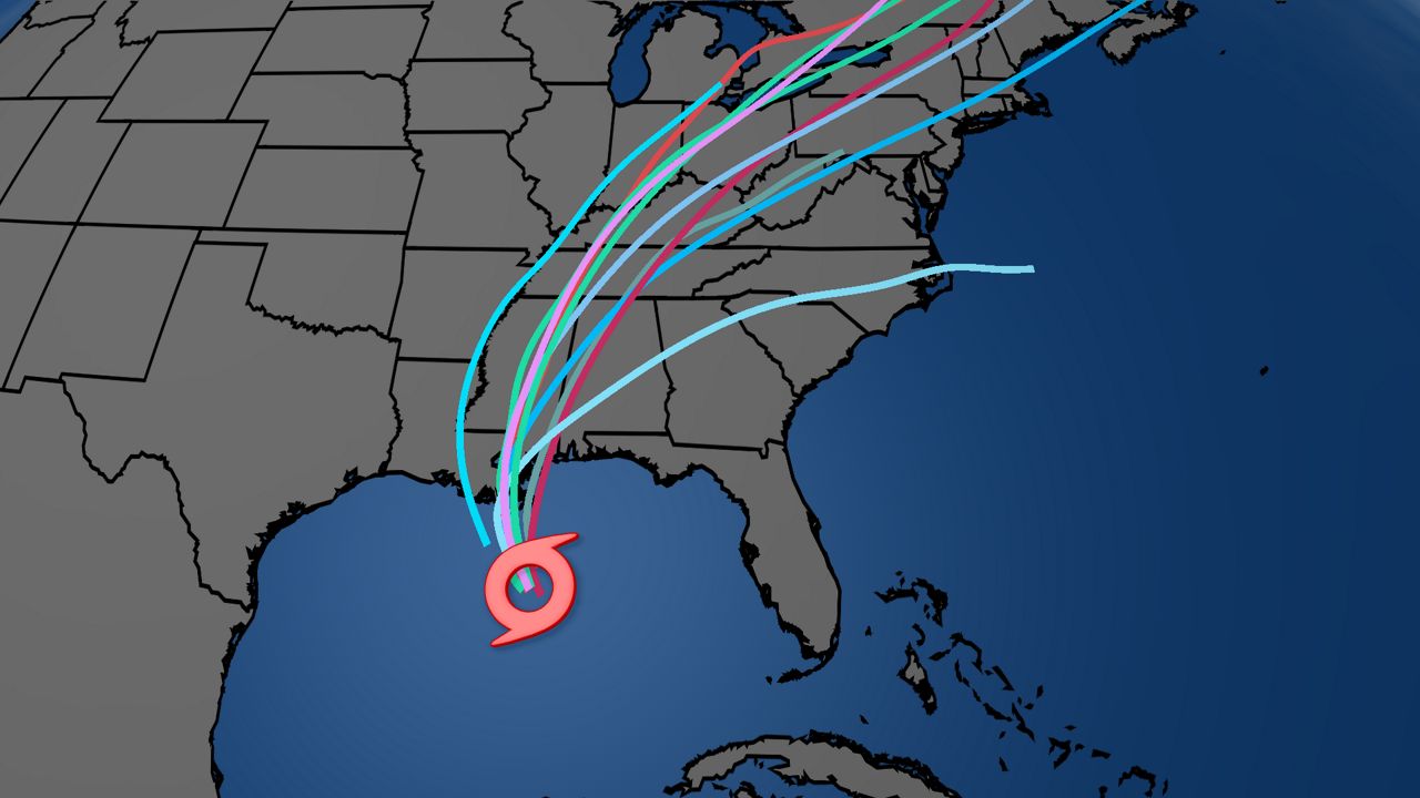
First things first, the spaghetti models show a series of individual computer forecast models, all overlayed together on one map. Each line on the map represents a separate computer forecast model or simulation.
Spaghetti models are a key tool to help forecasters determine where a storm might be headed, and how much confidence those forecast models might have on a given storm.
But with all the help spaghetti models can offer a forecaster, they can also be equally as deceptive, or even misleading, to the untrained eye.
Spectrum News chief meteorologist Mike Clay offered a strong word of caution on spaghetti models, along with when and how best to interpret them.
“The only thing the spaghetti [model] is good for is telling how much confidence we have in the models,” Clay said. “If all of the lines are on top of each other, it tells you the atmosphere is in a state that can be modeled and you should have greater confidence.”
“If the lines are all over the place," Clay continued, "It tells you there is low confidence and pay attention to changes.”
In particular, there is one individual ‘model’ that is actually a climatological representation of where a storm should go. However, that model, the so-called CLIP model, appears as a single line. But, this isn’t really a forecast model.
The CLIP, because it’s exclusively based on climatology, fails to take into account current weather conditions and factors. Because of that, it often shows up as an outlier.
Other models, like the Global Forecast System (GFS), are known for being not as strong at forecasting tropical systems. Some of the spaghetti models may be better with track, while others may specialize in intensity.
In other words: take the spaghetti models (and especially outliers) with a grain of salt, and leave the interpretations of them to the experts.
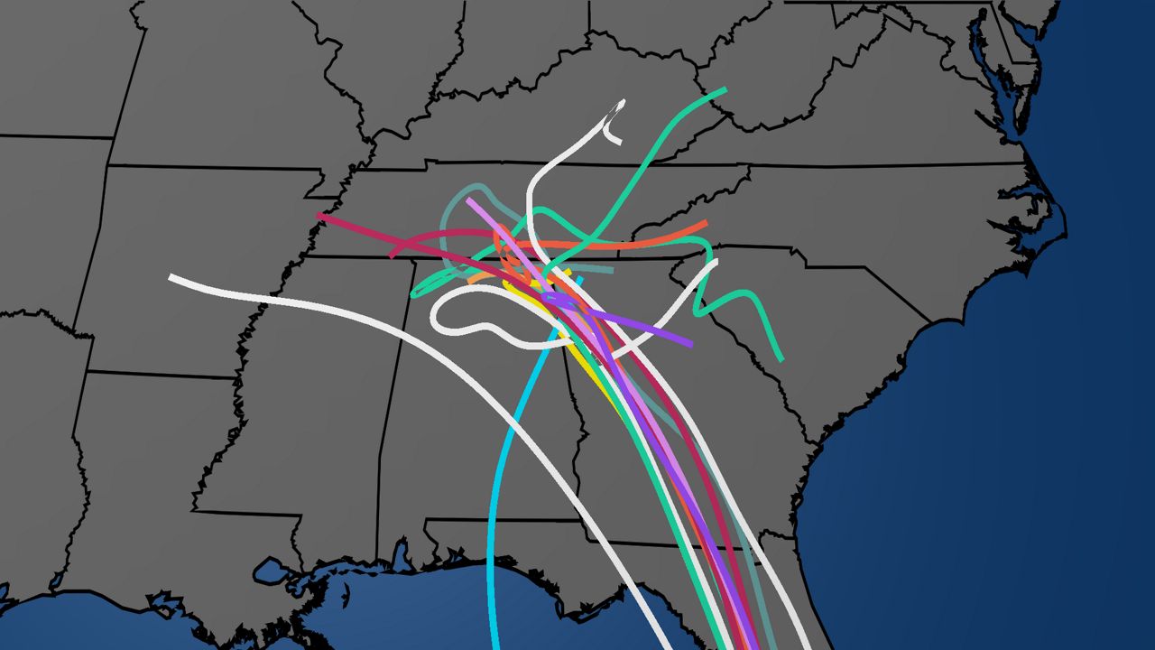
If the spaghetti models look like, say, a messy bowl of linguine pasta (like the example map below), that’s usually an indicator that there’s overall lower confidence about where the storm might be headed.

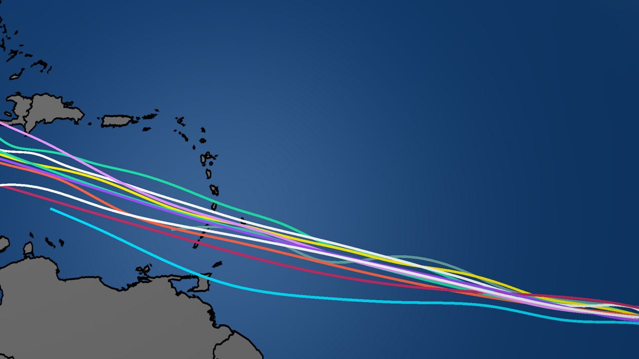
On the other side of things, if the spaghetti models resemble a straight line, that’s a good sign that the models may have a better idea about a storm’s possible path.
Think of it like an unopened package of grocery store spaghetti, a clustered, linear shape to the models is a signal of a higher confidence forecast.
In the map below, the initial clustering of lines shows a stronger confidence forecast. Later on, in the Caribbean Sea, the divergence of the models shows a lower confidence forecast.

Another key reminder about spaghetti models is that they are purely in reference to a specific storm’s track. They don’t, for example, consider a storm’s potential strength or other possible impacts, like flooding or storm surge.
“The spaghetti [models] have nothing to do with intensity,” Clay said.
When you see a spaghetti model map, also consider the other factors that could potentially make a storm dangerous, like intensity, forward speed and potential flooding, and storm surge.
So the next time you see spaghetti models, use them, but use them wisely.


